Under the hood of t-SNE – the t-SNE algorithm explained
Walk step-by-step through how t-SNE represents your high-dimensional data in two dimensions.
Adapted from the t-SNE for Flow Cytometry workshop by Robert Ladd, Facility Manager of the Flow Cytometry Core at Loyola University.

Introduction
As flow cytometry panel size increases, the dimensionality of flow data follow suit. t-SNE, or t-Stochastic Neighbor Embedding, has become one of the most widely used tools for visualizing high-dimensional flow data. In this blog post, Robert Ladd uses a simple example to take you step-by-step through the t-SNE algorithm so you can understand just how these plots are generated. This is part two of our three-part series on t-SNE for flow cytometry. For an introduction on when and why to use t-SNE to visualize your flow data, see part 1.
Overview
t-SNE is a dimensionality reduction method. In very simple words, that means we are projecting or arranging our high-dimensional data onto a lower dimensional space, typically 2D. t-SNE gives us a way for our simple monkey brains to look at this high dimensional data and see something where we can more intuitively grasp these high dimensional relationships, and to do that, we need to preserve something, ideally as much as we can, about those high-dimensionality relationships during this reduction.
It's good to know the math behind t-SNE, but I really want to break it down at a more conceptual level to give you an intuitive understanding of what's happening.
There are three main steps to the t-SNE algorithm.
First, in the high-dimensional space of our original dataset, we're going to measure the distance between points and assign similarity scores based on that. We'll then project our high-dimensional data onto a low-dimensional space. And then, that low-dimensional distribution is going to be iteratively adjusted until we have something that accurately represents our original high-dimensional data set. After these three steps, we hope to reach our goal of having a low-dimensional distribution that accurately represents the high-dimensional distribution.
To use an example, we're going to have a very, very simple data set (Figure 1). This is just a two-dimensional data set that we are going to reduce down to one dimension.
With normal t-SNE, you'll be going from something like twenty dimensions down to two. The principles are exactly the same. This is just so that we have something very concrete that we can point to.
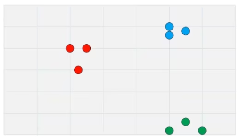
Figure 1: A simple two-dimensional dataset

The t-SNE algorithm step-by-step
1. Measure and normalize high-dimensional similarities.
Our first step is going to be finding and calculating these high-dimensional similarities based on their distance (Figure 2a). Using our two-dimensional data as an example, we are going to start with some initial points, in this case, that first red dot, and measure the raw distance to every other point in the dataset. In this case, I'm just showing two as an example, one red near-neighbor and one blue not-neighbor, but we will do this for every single point in both directions, so A to B and B to A for every single point.
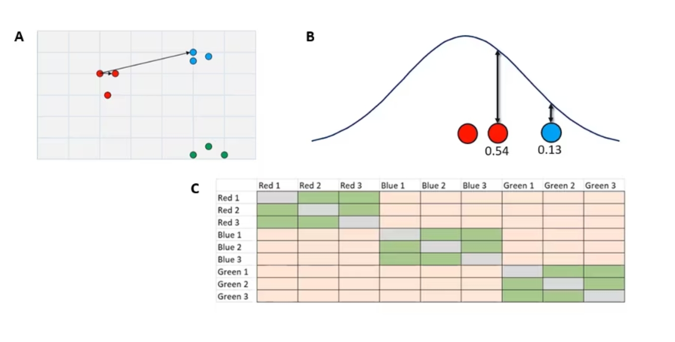 Figure 2. A. Measuring and normalizing high-dimensional similarities in our simple dataset
Once we have these raw distances, we are going to plot them under a normal distribution (Figure 2b) where it's centered over our initial point. The distance of any neighbor or not-neighbor to the center of the curve is going to be based on that raw distance that we found over in our two-dimensional data set.
From there, we draw a line up to the curve. The closer to the middle you are, the taller the curve is at that point. The length of line is going to be our similarity score. You can see that our more similar reds closer to the center are going have a higher similarity score than the lower similarity score of our blue dots.
The end result is a n-by-n similarity matrix (Figure 2c) that displays the similarity between every point and every other point. These green cells indicate very high similarity, and these orange cells indicate lower similarity. You'll notice the gray diagonal through the middle there. That's every dot’s similarity to itself. As far as t-SNE’s concerned, that is a zero.
From this high-dimensional data we now have this similarity matrix, and this is going to be the gold standard. Once we put this into the low-dimensional space of our t-SNE plot, how similar that new matrix is to this one is going to tell us how well our t-SNE has performed. We'll see that in just a second when we project our data down.
2. Project datapoints onto low-dimensional space
Now we're going to take our two-dimensional data and randomly project it onto a one-dimensional line here.
The random is where that stochastic nature comes in. And you can see now we have points that are just totally in a messed-up order (Figure 3a).
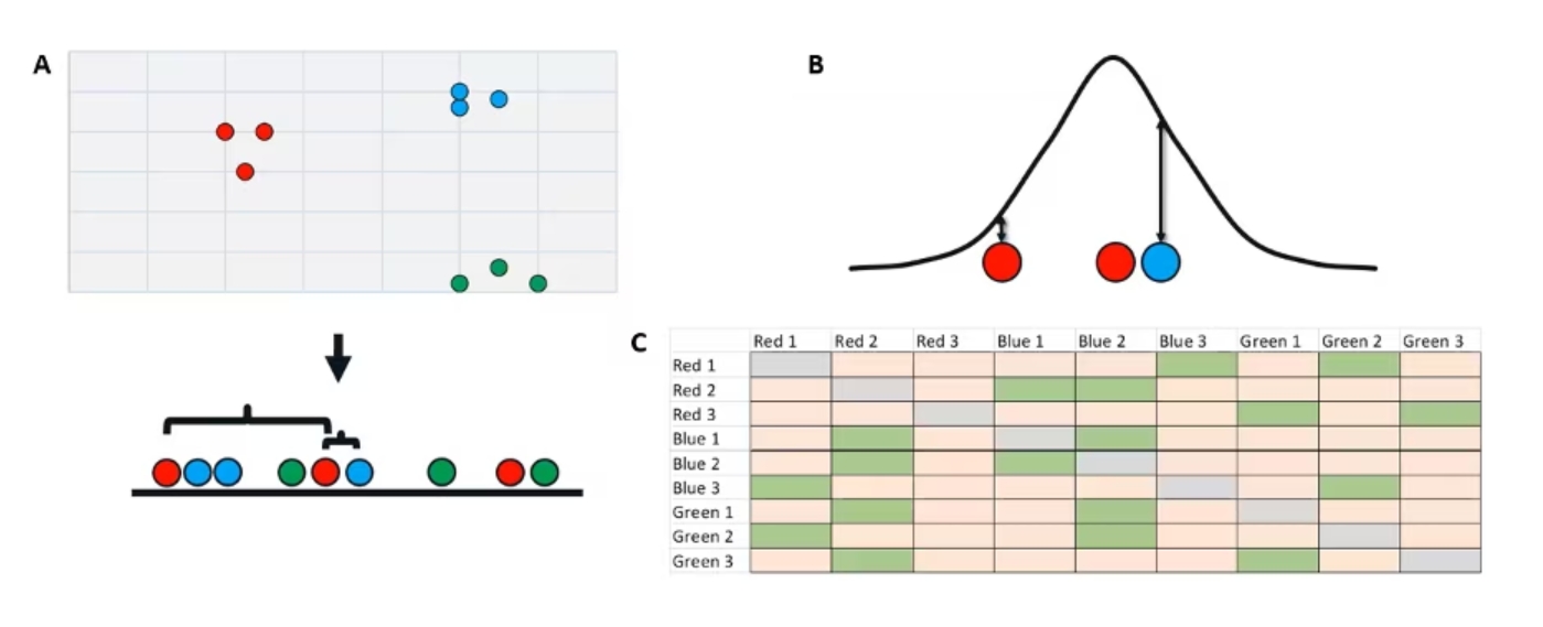
Figure 3. Randomly projecting our two-dimensional data onto a one-dimensional space.
At this point, we're going to do something very similar to our last step. We're going to measure the raw distance from our points to all the other points in our dataset. So just using the same three as an example, we have our initial red point in the middle. Its near red neighbor is now further away on this low dimensional space and that blue not-neighbor is now much closer.
Once again, using these raw distances, we’re going to plot them under a curve (Figure 3b). Critically, though, this time we are using a t-distribution rather than a normal distribution. This is the t in t-SNE. The reason we use a t distribution here, and I won't get too much into the nitty gritty, but essentially t-distributions have a shorter peak and taller tails.
If we have a point that is very, very far away from our initial point, compared to a point that's somewhat far away, with the normal distribution, they will both basically be zero. The t lets us get a little more separation between them. This is what we call the crowding problem. That's why we use a t-distribution here.
The end result is somewhat similar. We now get a new low-dimensional similarity matrix (Figure 3c), but since our initial order is random, our similarity matrix is totally scrambled. We've lost all those nice perfect diagonals we had in our high-dimensional similarity matrix.
3. Iteratively adjust the low-dimensional distribution
The next step is to fix it. We're going to take that low-dimensional distribution and adjust it until we have something that accurately represents our high-dimensional data set. Starting with our random initial order and the scrambled matrix that we derived from it, we're going to iterate. This is the iterations parameter you've maybe seen.
With each iteration, very similar points in the high dimensional space are going to attract each other. Very dissimilar points are going to repel each other. Over time, we will end up with something like this where all of our points clustered very well based on their high dimensional similarity. (Figure 4a)
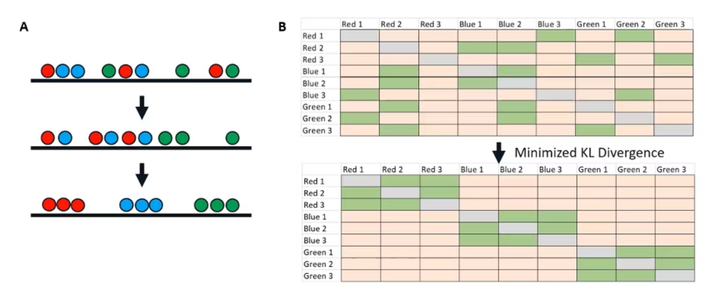 Figure 4. Iteratively adjusting the low-dimensional distribution
If we take this bottom low-dimensional iteration and make a new similarity matrix (Figure 4b), we have something that looks just like our high-dimensional similarity matrix. This is how we know we've reached the endpoint of our t-SNE and that we have something that accurately represents our high-dimensional data.
The key variable here is something called Kullback–Leibler divergence, or KL divergence. You can think of it very simply as just the difference between two probability distributions, or in this case, the difference between our two matrices here. Once we have minimized that divergence, once our low dimensional matrix looks like our high dimensional matrix, we know that we've reached an endpoint of our t-SNE, and we have something that is going to be useful for visualization.
And that is our end goal here. So just as a quick overview of all those steps, we start with high-dimensional data with a high-dimensional similarity index. We project that onto a lower-dimensional distribution and therefore, get a scrambled similarity index. And then we iterate that, adjusting so that similar points attract and dissimilar points repel until we end up with a new similarity matrix that reflects our original one.